How I designed Xflow’s Dashboard Home Page personalized for 3 different personas

Project Overview
Team
2 UX Designers
1 Product Manager
1 Visual Designer
Duration
1 Month
About Xflow
Xflow is a cross-border payments platform that enables B2B businesses, freelancers, IT service providers, goods exporters, and funded startups to seamlessly receive and manage international payments.
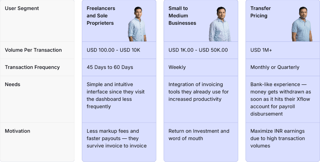
Xflow's direct users fall into three segments, each distinct at both the usage and compliance level. Their transaction volumes, visit frequencies, and documentation requirements differ significantly — which means the information they need at a glance, and the actions they need to take, differ too. This created both the problem and the opportunity: a single home page was failing all three segments, and understanding each segment precisely enough to design for them separately was the path to fixing it.


User feedback collected through product interviews pointed to a recurring theme:
The path analysis from PostHog gave that feedback a concrete shape.
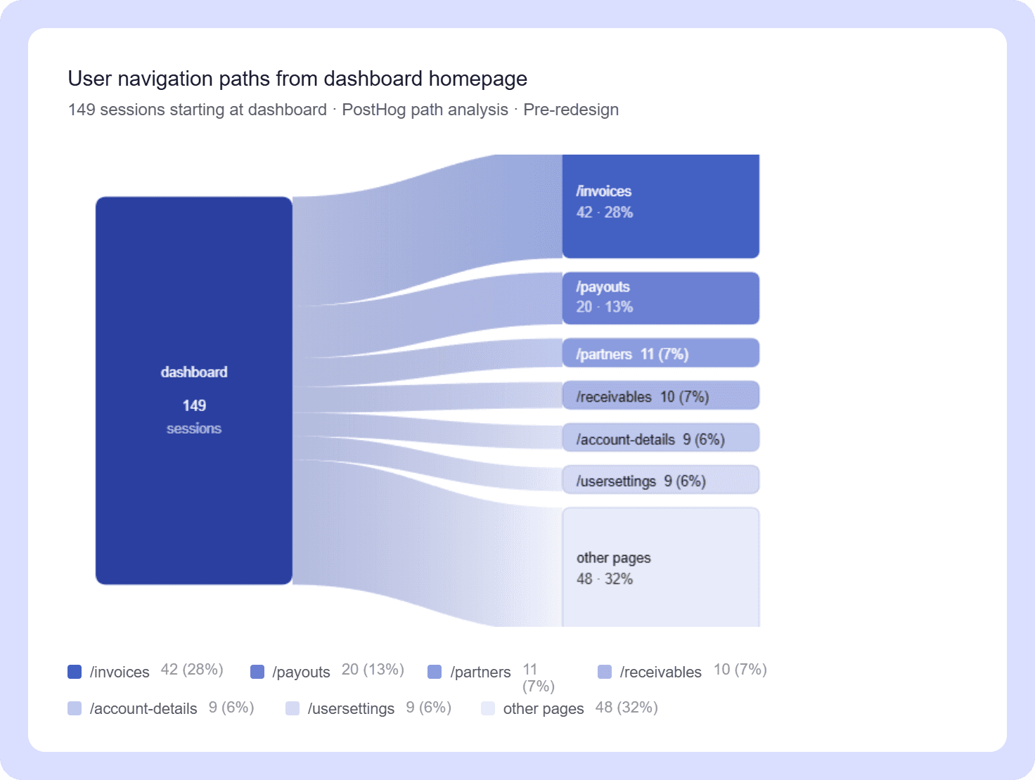
Of 149 users starting from the dashboard homepage, no single next destination captured even a third of them. Traffic fragmented across six pages — /invoices (28%), /payouts (13%), /partners (7%), /receivables (7%), /account-details (6%), and /usersettings (6%) — with a long tail of smaller paths making up the rest. A homepage that's working well should orient users toward their most important next action. This one was sending everyone in a different direction.
The exits to /account-details and /usersettings were a further signal — these pages are primarily set up during onboarding and have little reason to be visited during active use. Users navigating there from the homepage suggested the dashboard wasn't surfacing anything more relevant to act on.
The underlying cause was straightforward: the home page was identical across all user segments, despite their fundamentally different workflows and visit patterns. A freelancer receiving payments every 45–60 days and a Transfer Pricing user managing million-dollar monthly transactions were looking at the same screen — including widgets built for each other's use cases. The result was a dashboard that felt busy to everyone and purposeful to no one.
Each segment was designed for independently. The process followed the same structure across all three: start with the widget inventory and requirements from the Product Team, research each widget individually, explore and design. The guiding principle throughout was simple — design only what is relevant to that user, at that state.
Starting with Freelancers & Sole Proprietors.
Designing Widgets
Starting with the Design Process of widgets, starting with the New Widgets
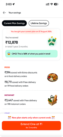
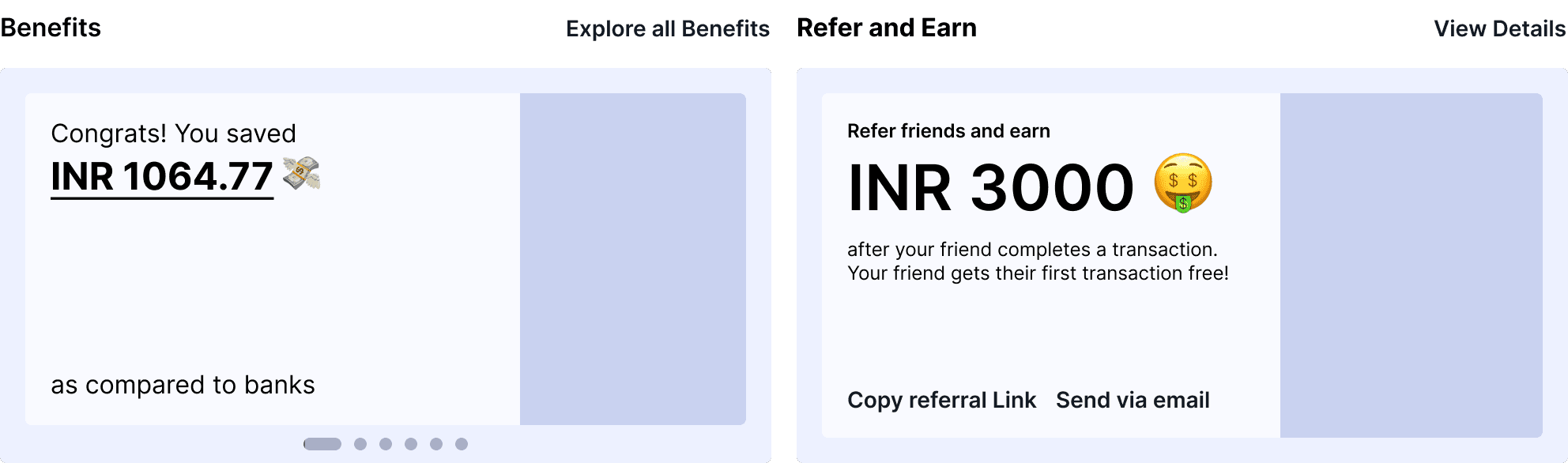
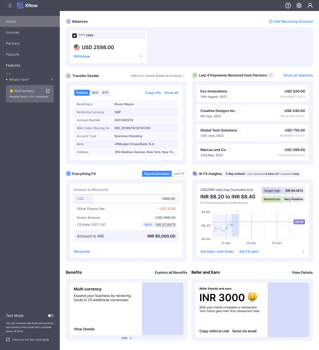
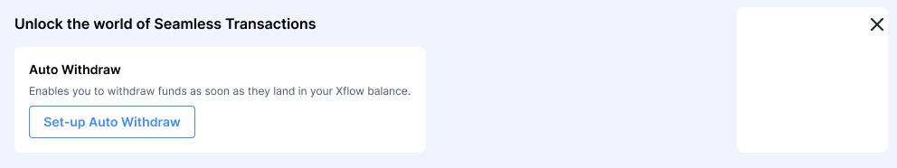
Benefits Widget
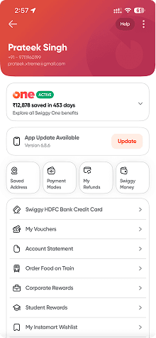
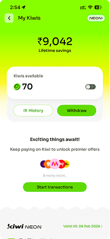
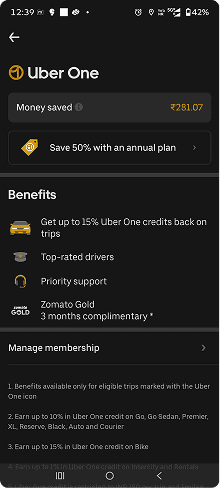
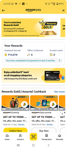
I conducted industry research on how leading platforms communicate user benefits — studying apps like Swiggy, Kiwi, Amazon, Uber, and others.

Key insights from industry research:
They don't simply display how much the user has saved. Instead, they frame the number within a sentence that gives it meaning. For example: "You saved ₹9,220 on shopping."
Each metric is paired with a small illustration that visually supports and reinforces the data point.
I am Xflow user
“How do I know that I saved on Xflow?”
“How do I know how fast the payouts reached my Indian bank account?”
“How do I know how many payouts I made on Xflow?”
“How do I explore all the features of Xflow?”
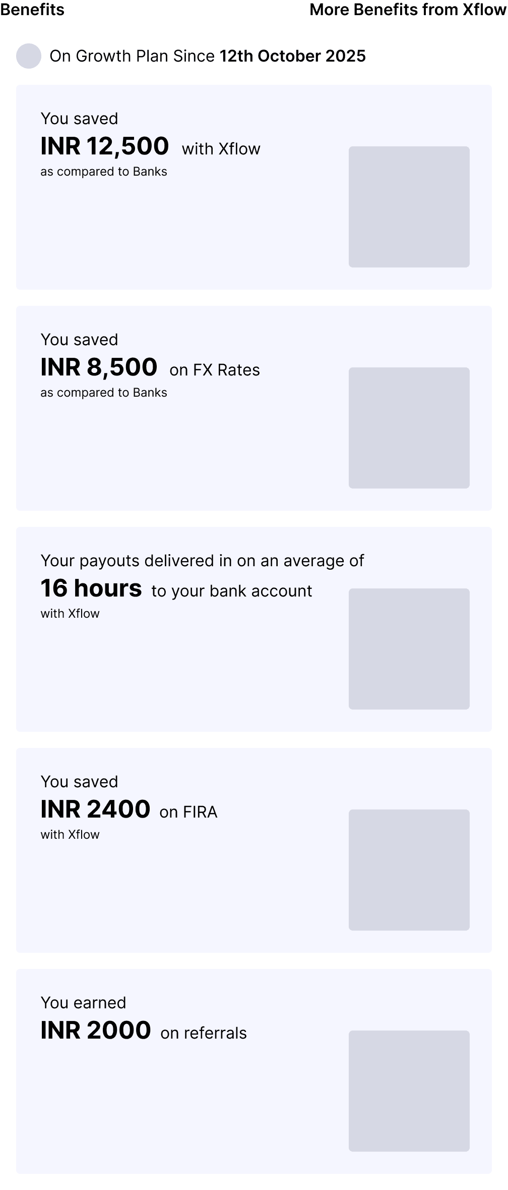
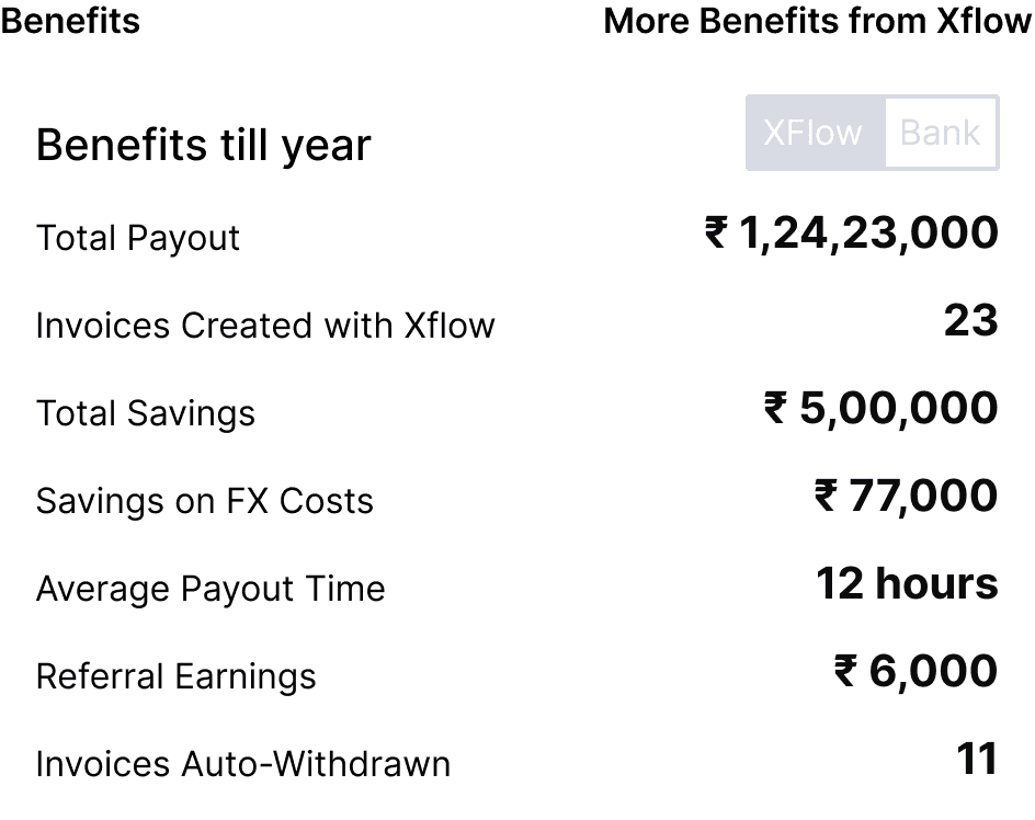
Metrics
Total Payouts Received
Total Savings with Xflow as compared to Banks
Average Payout Time as compared to Banks
Total Referral Earnings
Xflow Features
Multi-Currency
SaaS Payments
Zoho Books
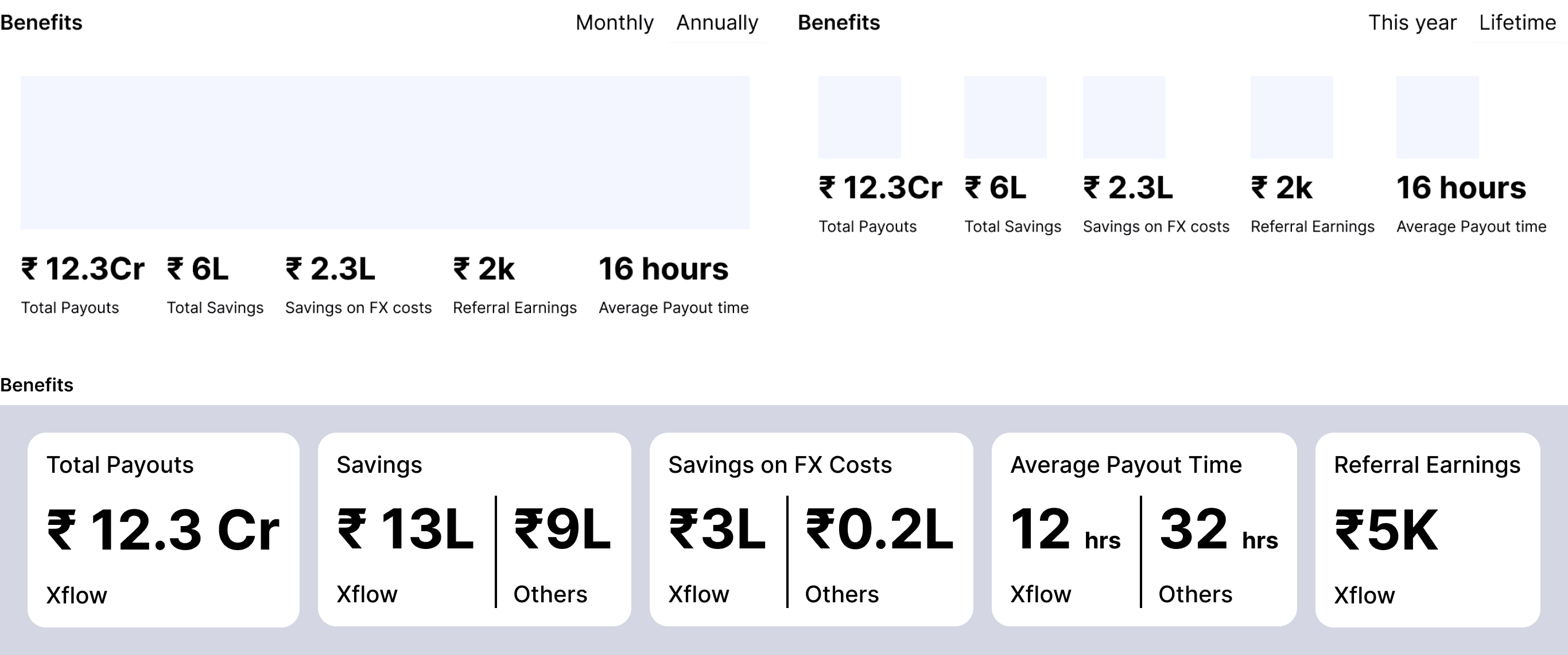
The first round of explorations kept the widget horizontal — a natural starting point given the dashboard's existing layout conventions. Two to three distinct directions came out of this, but all of them shared the same problem: too much information visible at once. Every metric competed for attention equally.
Then, for more exploration, I asked — why restrict horizontally? Let's explore more vertically.

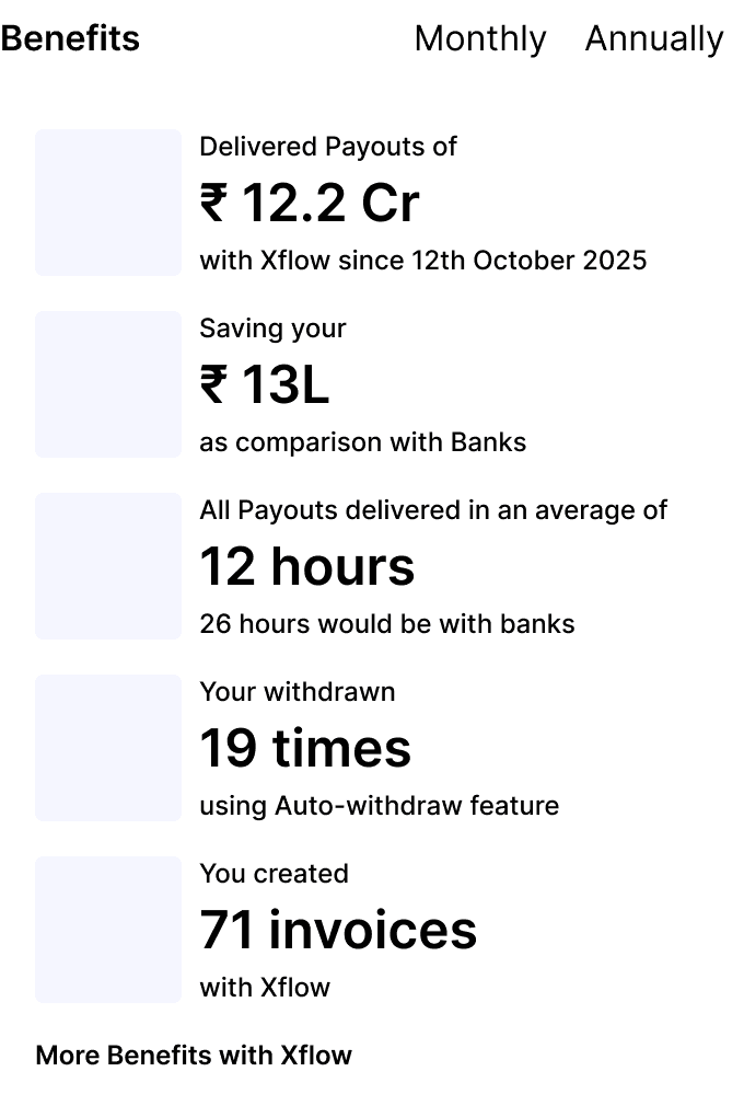
Exploring vertically broke that constraint. Freed from the assumption that the widget had to sit within a horizontal band, the layout could be reconsidered from scratch — which led directly to the idea of a carousel.

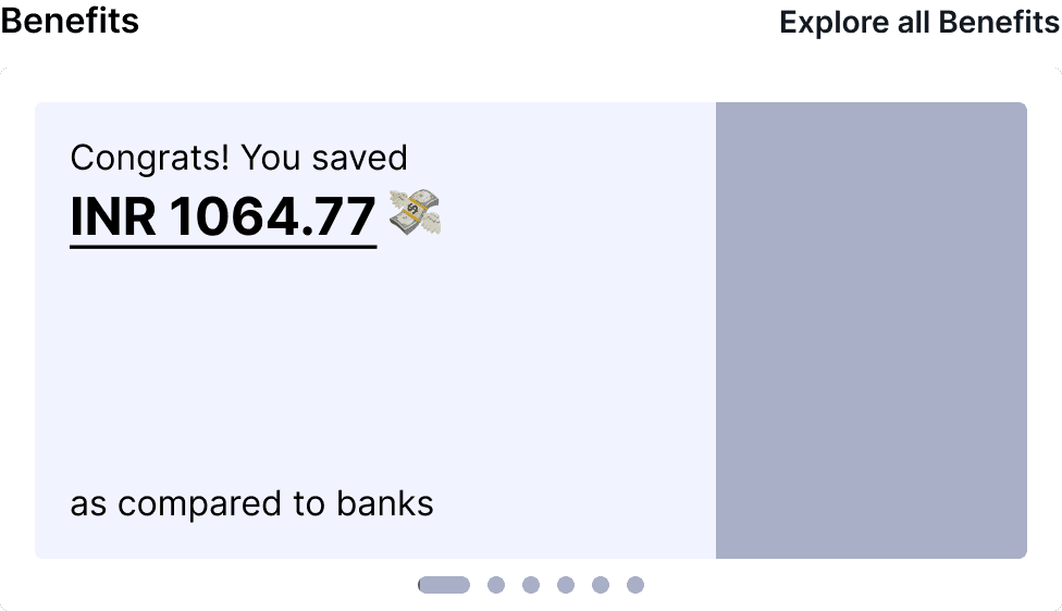
The Carousel idea was promising - One metric per card, revealed one at a time, meant the user could absorb each number without being overwhelmed by all of them simultaneously. The carousel also saved space both horizontally and vertically, making it compatible with the other widgets sharing the dashboard.
While designing Benefits Widget, I was going through the design process for Referrals parallelly.
Referrals Widget
I studied how leading consumer platforms — Swiggy, PhonePe, Amazon, and others — present referral programs to their users. The goal was to understand what makes a referral widget feel worth engaging with rather than dismissable.


Key insight:
Every platform that drove high referral adoption used bold illustrations and prominently displayed the reward amount.
I am Xflow user
“How do I know how the referral program works?”
“How do I refer my friends?”
“How do I track referrals and earnings?"
“How do I explore all the features of Xflow?”
Reward Amount for the referee
Reward for the referred user
Referral Link sharing CTA
Referral link
View Details CTA
Two directions were explored. The first focused on selling the referral program — leading with the reward amount and a bold illustration. The second laid out how the program works, breaking the mechanic into short 3–4 word steps.
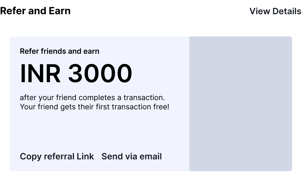
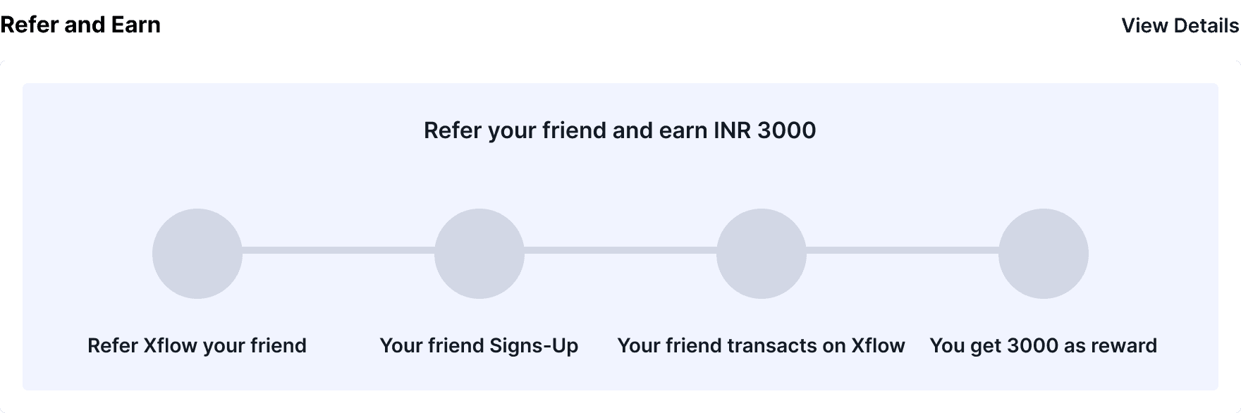
We went with the first. A referral widget's job is to make earning money feel attractive, not to explain a process. Industry research confirmed this — every platform with strong referral adoption led with the reward, not the instructions. If a user wants to understand the details, that's what the full referral page is for.
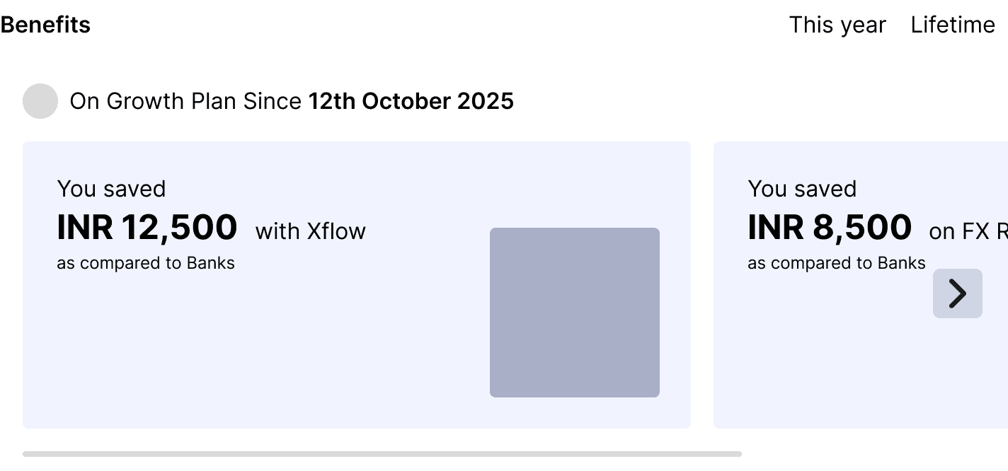
Since the information in the "simply selling" exploration was minimal, the width of the referral widget could fit in half the width of the dashboard. And since the Benefits widget was decided to be in a carousel format, Referral and Benefits could fit together — side by side, each taking half the dashboard width.
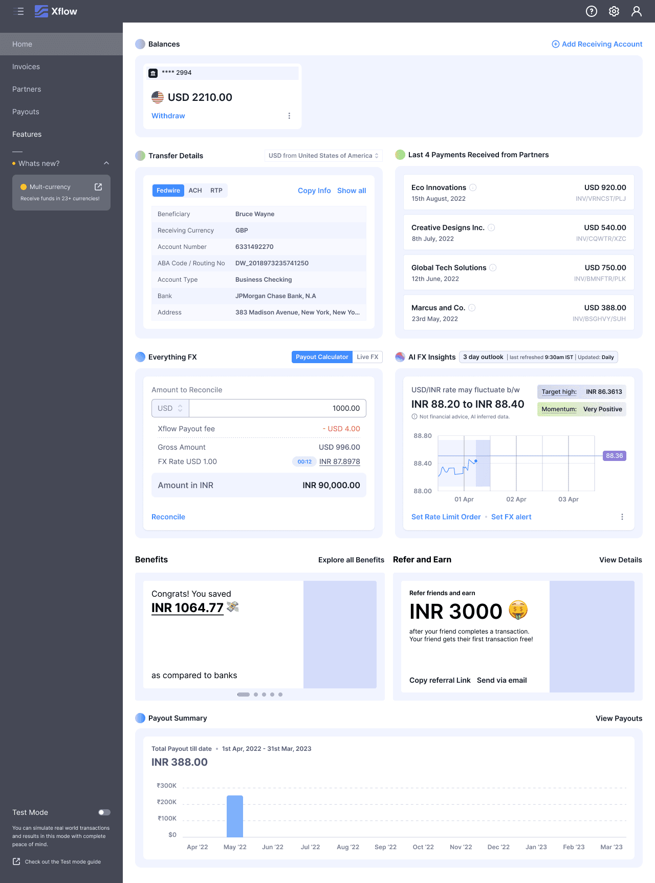
Deposits Widget
This is an existing widget.
Research
During the Product Feedback sessions, users reported that they visited this widget more often than others — but since it sat at the bottom of the dashboard, they struggled to scroll down and find their deposits.
From this feedback, we also learned that users need to see the top 4–5 payments received quickly at a glance.
We wanted to push the widget up in the dashboard, next to the Bank Transfer Details widget, for the following reasons:
FX Analyst was getting revamped parallelly — the FX AI Analyst, which earlier occupied half the dashboard width, was now taking the full width of the dashboard. This freed up space.
Logical proximity — Sitting next to Bank Transfer Details fits best logically, as both are closely related: Sharing Transfer Details → Getting paid by the partner.
Information Architecture
The widget surfaces the four most recent deposits without requiring the user to scroll. Partner name and received amount with currency sit at the top of the hierarchy — the two pieces of information a user needs to identify a payment at a glance. Date sits below as supporting context.
Inferred Partner Name
Currency
Amount
Date
Payment Miscellaneous Information
UX Design

Get Started Widget
This is an existing widget.
We conducted research on the effectiveness of the Get Started widget and how much users were actually using it. We ran two studies:
We compared how many users clicked the Get Started widget CTAs versus other CTAs on the dashboard. For reference, we used the "Withdraw" CTA from the Balances widget.
Insight
The 3 CTAs from the Get Started widget were clicked nowhere close to the Balances widget CTA.
We compared the click rate of the Create Invoice CTA from the Invoices tab vs. the Create Invoice CTA from the Get Started widget. We conducted this because, except for Create Invoice, every other ingress was already provided on the home page. Still, we wanted to know the effectiveness of the Create Invoice CTA itself.
Insight
Despite having no other ingress for Create Invoice on the home page, users preferred creating invoices from the Invoices tab.
Usage data made the case clearly. The Get Started widget's three CTAs were clicked at a fraction of the rate of equivalent CTAs elsewhere on the dashboard. Users creating invoices overwhelmingly did so from the Invoices tab, not from the widget. And the Share Bank Transfer Details CTA duplicated an action already available on the Bank Transfer Details widget itself.
The widget was occupying prime dashboard real estate while offering nothing that wasn't already accessible from a more natural context. We removed it entirely — across all three user segments and all dashboard states — in favour of a homepage where every element earns its place by showing the user something genuinely useful about their account.
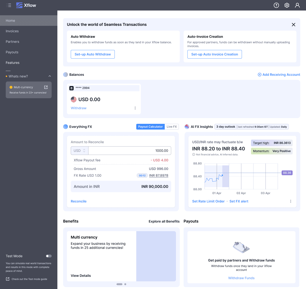
Final UX Design
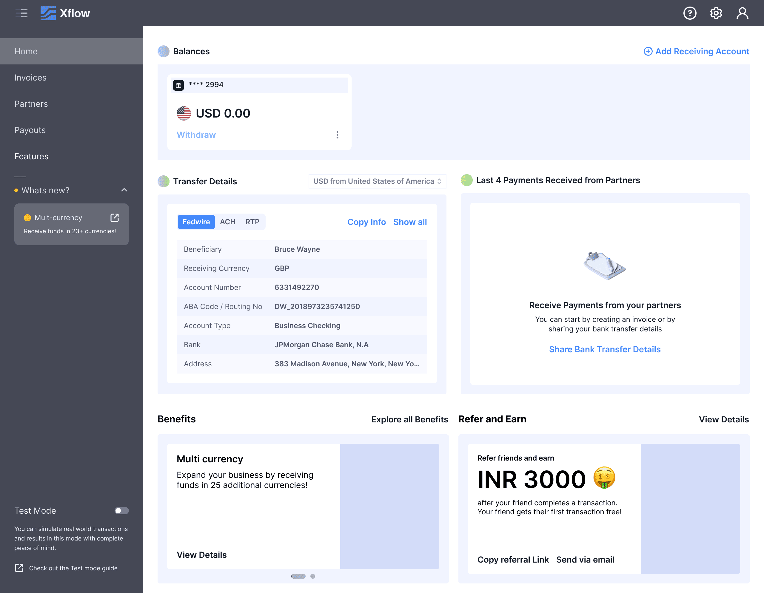
The Day 0 experience is intentionally stripped back. The Balances widget shows a zero balance, and the Deposits widget is in its empty state — both are placeholders waiting for the first payment to arrive. The visual hierarchy of the entire screen points toward one action: sharing bank transfer details with a partner
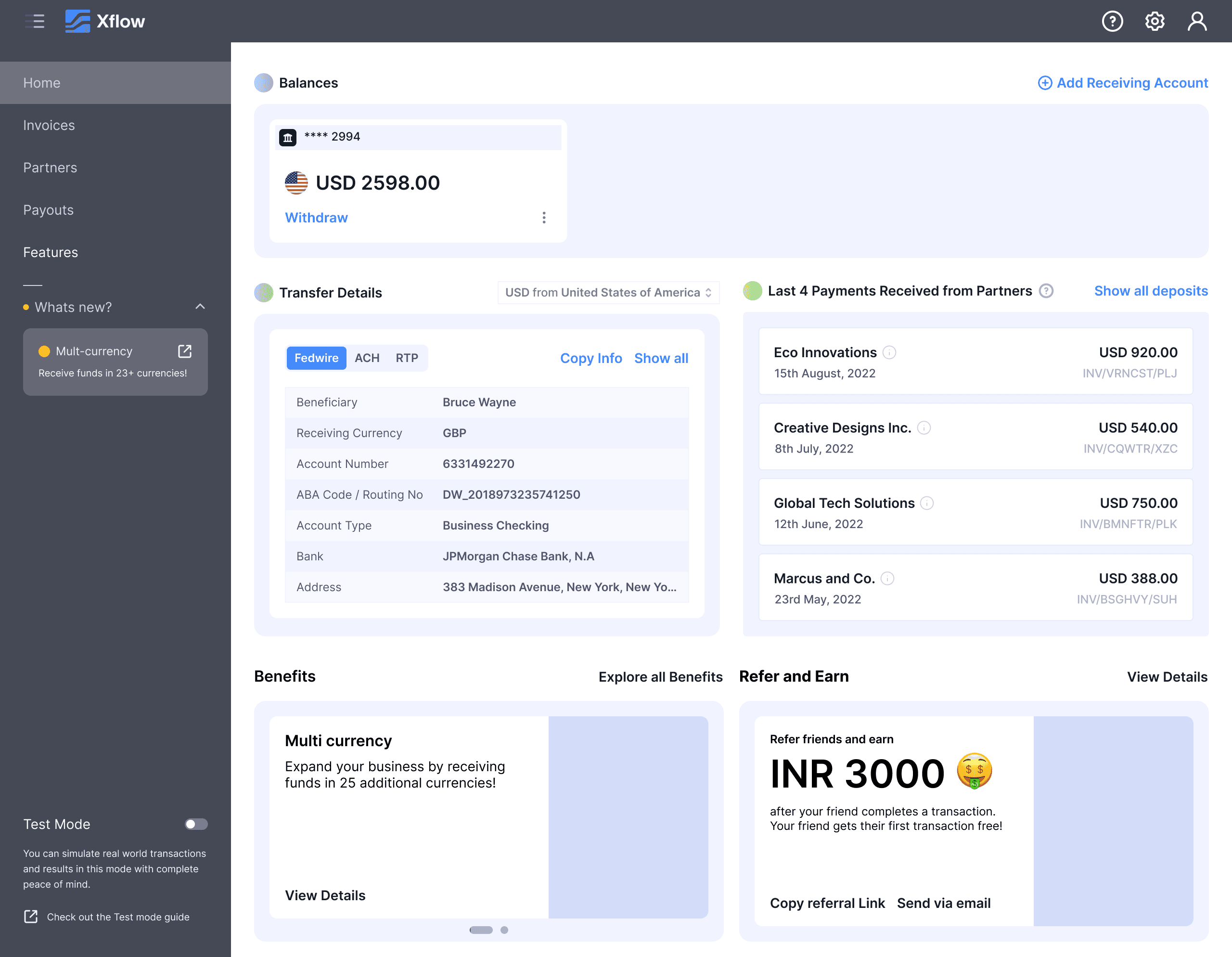
The Deposits widget populates with the incoming transaction. Balances updates, and the Withdraw button activates. The screen stays focused — the next step is obvious.
FX AI Analyst and Payout Summary appear after the first withdrawal. Benefits now shows metric cards alongside Features Cards — there's real activity to report. Benefits and Referral stay on the dashboard from this point on.
The fully populated Freelancer dashboard. Compared to before, the screen carries only what a freelancer actually needs — the clutter is gone.
Before personalization, the Freelancer dashboard carried every widget available on the platform. After personalization, the dashboard is stripped to what a freelancer actually needs on any given visit: their balance, bank transfer details, recent deposits, and reasons to stay on Xflow.
Before

After
Small and Medium Businesses
This segment needs integration with their existing platforms, and ROI is what motivates them to stick with the platform. Based on product feedback, the Product Team suggested the following widgets for the SMB & ITes home page:
Suggested Widgets
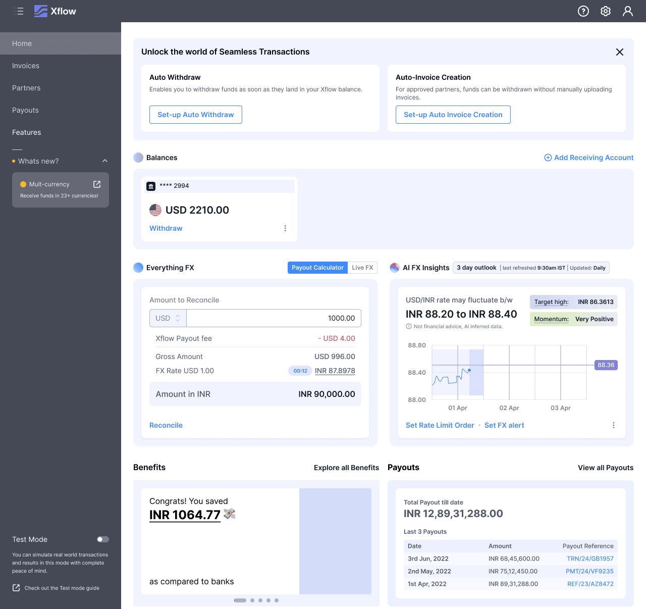
Balances Widget — Displays balances across currencies. These balances reflect after the user receives a payment in that currency.
Bank Transfer Details — Contains the transfer details of the user's Xflow account. Users can share details directly via a Copy CTA or through a detailed view modal accessed from a CTA on the widget.
Payout Summary — A historical graphical view of the payouts the user has made.
Deposits Widget — Lists all deposit entries of payments the user received from their partners.
Benefits Widget (New) — Designed to give users reasons to stick with Xflow. Shows total payouts made, average payout landing time compared to banks, total savings with Xflow compared to banks, and Xflow features.
Referral Widget (New) — Promotes the Xflow referral program.
FX AI Analyst — An existing widget that helps users make informed decisions on foreign exchange.
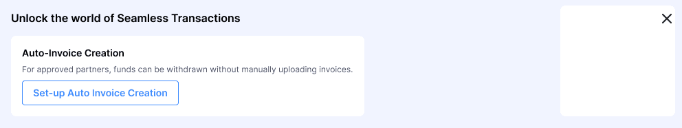
Zoho Books Connect (New) — This widget was meant to provide an ingress for the Zoho Books Integration.
Out of these, Zoho Books Connect is newly addressed in this segment. This widget was meant to provide an ingress for the Zoho Books Integration. However, since we had already covered the integration ingress in the Features Cards of the Benefits widget, we decided to skip designing a separate Zoho Books Connect widget.
Therefore, there are no new widget designs for the SMB & ITes segment — the existing widget set, combined with the Benefits widget's Features Cards, already addressed their needs.
SMB users see FX AI Analyst from Day 0. This segment arrives financially literate and ROI-focused — surfacing advanced tools immediately reflects that. Benefits Features Cards include a prompt toward the Zoho Books integration, addressing their need for tooling continuity.

Deposits populates, Balances activates the Withdraw button. FX AI Analyst, already on screen since Day 0, becomes directly actionable — the user now has a balance to make decisions on.
Payout Summary appears, completing the dashboard. The Day N layout matches the Freelancer segment — the difference between the two segments lives in the journey, not the destination.
The Day N state is visually identical to the Freelancer segment. The distinction was in the progression — what was shown on Day 0 and when each widget appeared.
Before personalization, the SMB dashboard looked identical to the Freelancer view, burying FX tools and integration prompts beneath widgets irrelevant to their workflow. After personalization, FX AI Analyst and Zoho Books integration are visible from Day 0 — reflecting that SMB users arrive with existing financial tooling and immediately seek ROI signals.
Before
After
This segment needs a bank-like experience and wants to maximize their INR earnings due to high transaction volumes. To serve this, we wanted to drive these users toward the most sophisticated features on Xflow — Auto Withdrawal, Auto Invoice Creation, FX AI Analyst, and Limit Orders.
Suggested Widgets
Balances Widget — Displays balances across currencies. These balances reflect after the user receives a payment in that currency.
Benefits Widget (New) — Designed to give users reasons to stick with Xflow. Shows total payouts made, average payout landing time compared to banks, total savings with Xflow compared to banks, and Xflow features.
FX AI Analyst — An existing widget that helps users make informed decisions on foreign exchange.
Configure Widget (New) — A dismissible widget that drives users to enable Auto Invoice Creation and Auto Withdrawal. It gets dismissed when the user either dismisses it on purpose or enables the features.
Out of these, Configure Widget is newly addressed in this segment.
Starting with the Design Process of widget, starting with the New Widget - Configure
Configure
Since TP users are high-volume users, the Sales Team ensures their onboarding is as smooth as possible — explaining the Auto Withdrawal and Auto Invoice Creation features during onboarding.
It is up to the users whether they want Auto Invoice Creation, Auto Withdrawal, or both. The Sales Team then coordinates with Ops and Engineering to enable the appropriate features in settings.
To drive users to the settings, we had a banner serving as an ingress. However, the Sales Team shared feedback that users were ignoring the banner and instead contacting the Sales Team directly to guide them through enabling the features.
The banner looked the same as any other Xflow feature banner — which was likely the reason it was ignored.
Key insights from industry research:
They don't simply display how much the user has saved. Instead, they frame the number within a sentence that gives it meaning. For example: "You saved ₹9,220 on shopping."
Each metric is paired with a small illustration that visually supports and reinforces the data point.
Exploration 1 — Dismissible Widget
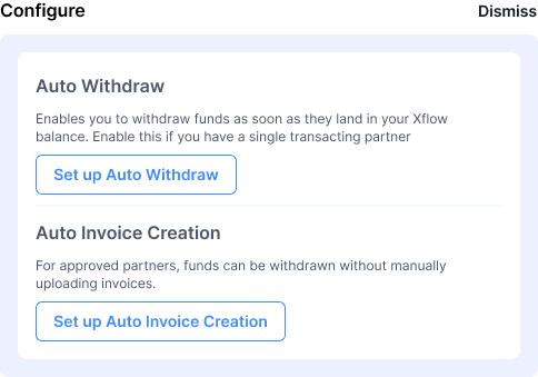
I explored a dismissible widget that fits next to the Benefits widget, since TP users didn't have the Referral widget as the referral program didn't apply to them. After dismissing the configure widget, the benefit widget would take full width of the dashboard.
Exploration 2 — Banner
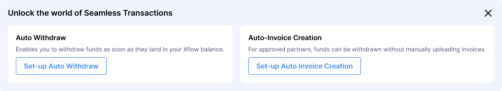
I also explored the banner pattern, as the dismissible behavior fits best with a banner. Since we wanted to drive users to enable features, it made sense to place it at the top of the dashboard.
We decided to go with the banner approach. The earlier banner was a generic features banner. This time, I tailor-made 3 banners based on what the Sales Team communicates about each user's needs:
Auto Withdrawal only — Information and CTA for enabling Auto Withdrawal
Auto Invoice Creation only — Information and CTA for enabling Auto Invoice Creation
Both — Combined information and CTAs for both features
Payouts Widget
Though this widget was not suggested by the Product Team, I conducted my own research and advocated for its place on the TP users' screen.
When designing the Freelancers home page, the Benefits and Referral widgets were paired together side by side. Since the Referral widget was not a TP use case, there was a void to be filled. But more than just a void — there was a need to be filled.
TP users visit the dashboard monthly or quarterly. With Auto Withdrawal settings enabled, they visit even less frequently. When they do visit, their primary reasons are:
To get compliance documents for payouts
To check whether payouts are in processing or processed status
Therefore, Payouts is an important widget for TP users. I designed the Payouts widget to sit alongside the Benefits widget, filling both the visual and functional gap left by the absent Referral widget.

The widget shows the three most recent payouts, each with a direct link to the payout detail page — where TP users go to check processing status or download compliance documents. This is the primary reason a TP user visits the dashboard, and the widget puts it one click away.
At the top of the widget, a running total of all payouts made with Xflow is displayed alongside the change since the user's last visit. For a segment managing high transaction volumes, this number serves as a trust signal and a quick confirmation that the platform is doing its job.
A Configure banner sits at the top of the dashboard — tailored per user by the Sales Team before first login. It could prompt Auto Withdrawal, Auto Invoice Creation, or both, depending on what was agreed during onboarding. The Payouts widget is in an empty state. Benefits shows Features Cards, surfacing advanced capabilities to a segment ready to use them immediately.
The Payouts widget populates — for TP users, this is the primary reason to visit the dashboard: checking payout status and pulling compliance documents. The Configure banner is dismissed either manually or once the user enables the configured feature. Benefits and Payouts sit side by side in the space it leaves behind.
Final Visual Design
The TP dashboard has a noticeably different character from the other two segments — no Referral widget, no Payout Summary graph, a Payouts list in their place. Built for infrequent, high-intent visits.

Before personalization, Transfer Pricing users landed on a dashboard designed for much lighter usage patterns. After personalization, the home page reflects how TP users actually interact with Xflow: infrequently, purposefully, and with an immediate need to check payout status or pull compliance documents. The Configure banner and Payouts widget serve exactly those needs.
Before
After
Impact
What changed for users
The personalized home page reduced dashboard clutter for all three segments by surfacing only the widgets relevant to each user's workflow. For Freelancers, the simplified Day 0 experience creates a clear path from receiving bank transfer details to making a first withdrawal — reducing the decision load for users who visit infrequently. For SMBs, FX AI Analyst visibility from Day 0 supports the ROI-oriented mindset this segment brings to the platform. For Transfer Pricing users, the tailor-made Configure banners gave the Sales Team a structured handoff point, replacing an ad-hoc support loop where users were calling the Sales Team to navigate settings they should have been able to find themselves.
This Project Helped Other Projects
The home page also became a distribution layer for other product initiatives — the Referral Program, Zoho Books integration, and Limit Orders all gained meaningful visibility through widgets and feature cards that previously had no home.
Reflection
What I learned
The most useful design decision I made was advocating for the Payouts widget on the TP segment without being asked. That wasn't on the product brief — it came from noticing a functional gap (no Referral widget for TP users) and asking whether the space should be filled with something meaningful rather than left empty. The stakeholders agreed. It reinforced something I try to carry into every project: the brief defines the floor, not the ceiling.