
Project Overview
The project was to design a user friendly AI Help Experience on the Xflow Dashboard. This was designed to provide help to the users while using the Xflow Dashboard and during critical flows like money movement and Onboarding.
Team
1 UX Designer
1 UX Mentor
1 Product Manager
Duration
1.5 Months
About Xflow
Xflow is a cross-border payments platform that enables B2B businesses, freelancers, IT service providers, goods exporters, and funded startups to seamlessly receive and manage international payments.
Xflow's users span freelancers, sole proprietors, startup owners, and finance employees — all technically literate enough to process payments, but not necessarily familiar with cross-border compliance terminology. The support queries reflected this: users weren't confused by technology, they were confused by the domain. Terms and concepts specific to international payments created friction that the product's existing static help wasn't equipped to resolve. Add to that users missing CTAs and features that were right in front of them, and the support load was spread across every part of the product — onboarding, payment flows, and account management alike.
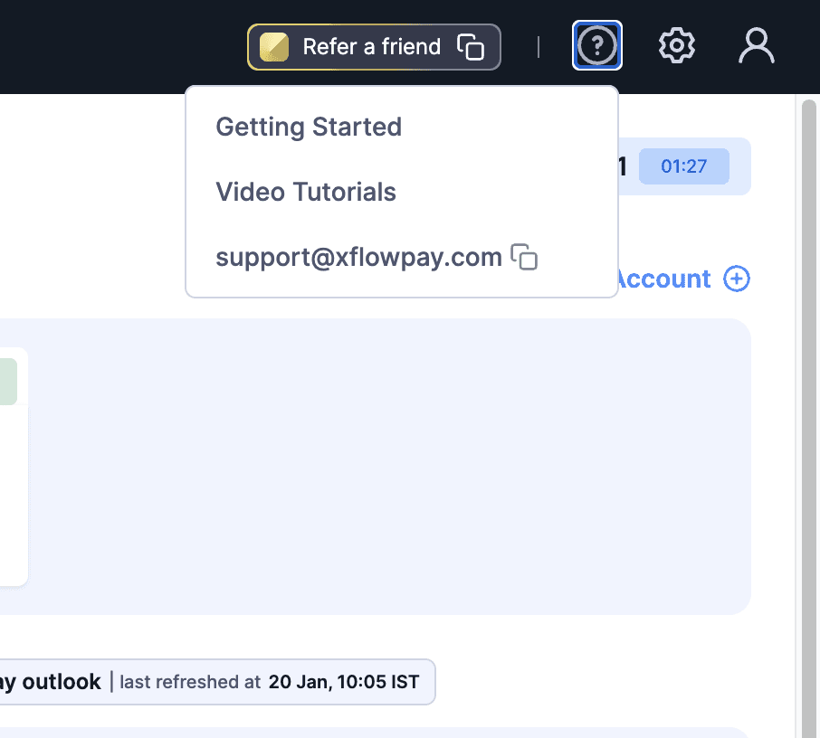
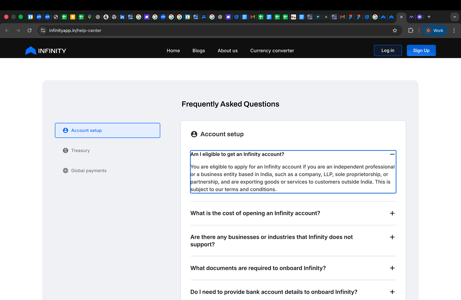
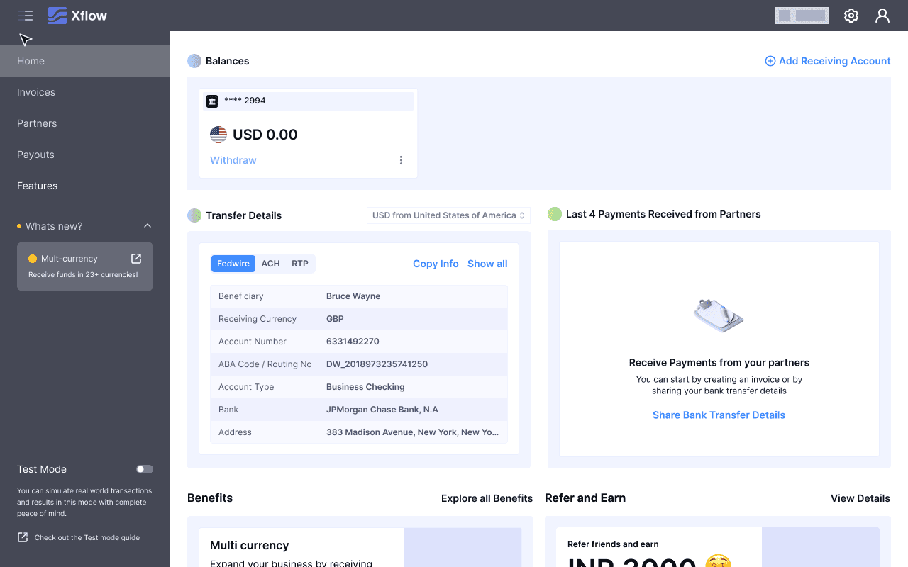
The Xflow Dashboard currently is offering static help such as Dashboard Walkthroughs and Video Tutorials, making users to reach out to support email whenever they are stuck. This increased the number of support tickets the Xflow Team has to handle.
To understand how AI help could improve the support experience, I conducted the research in two directions: Industry Research and User Research.
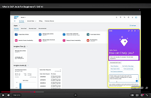
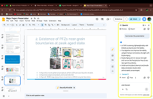
Pattern 1: Chat Window


Pattern 2: CTAs for specific tasks
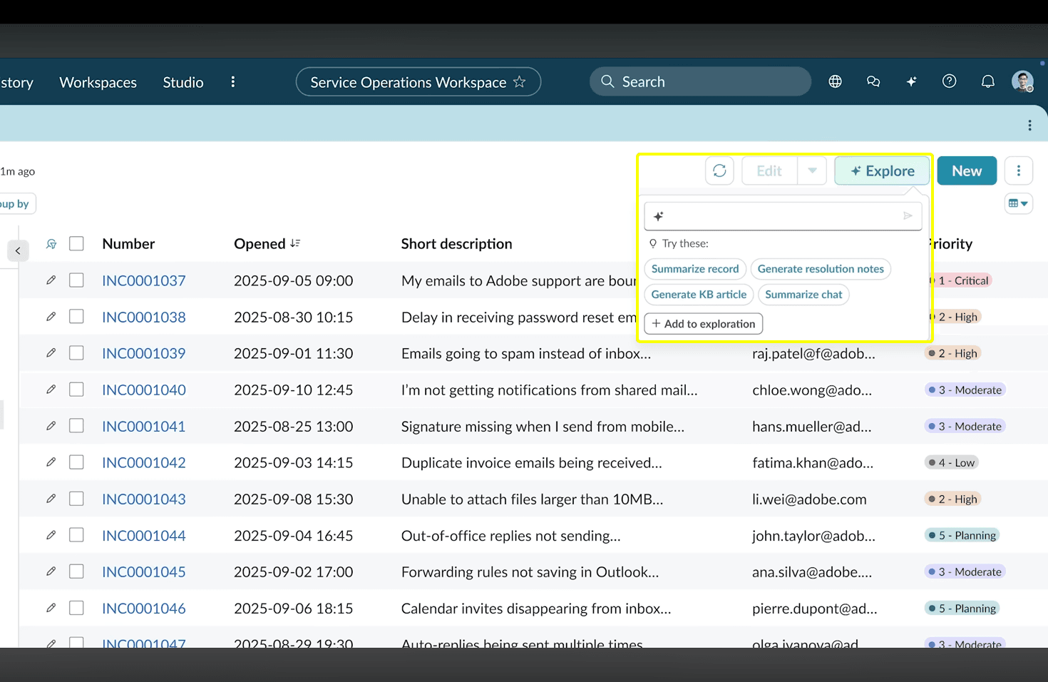


Pattern 3: Automation
Help Patterns in Platforms
Pattern 1: Static Help
Pattern 2: AI-Powered Help

Industry Research Key Takeaways
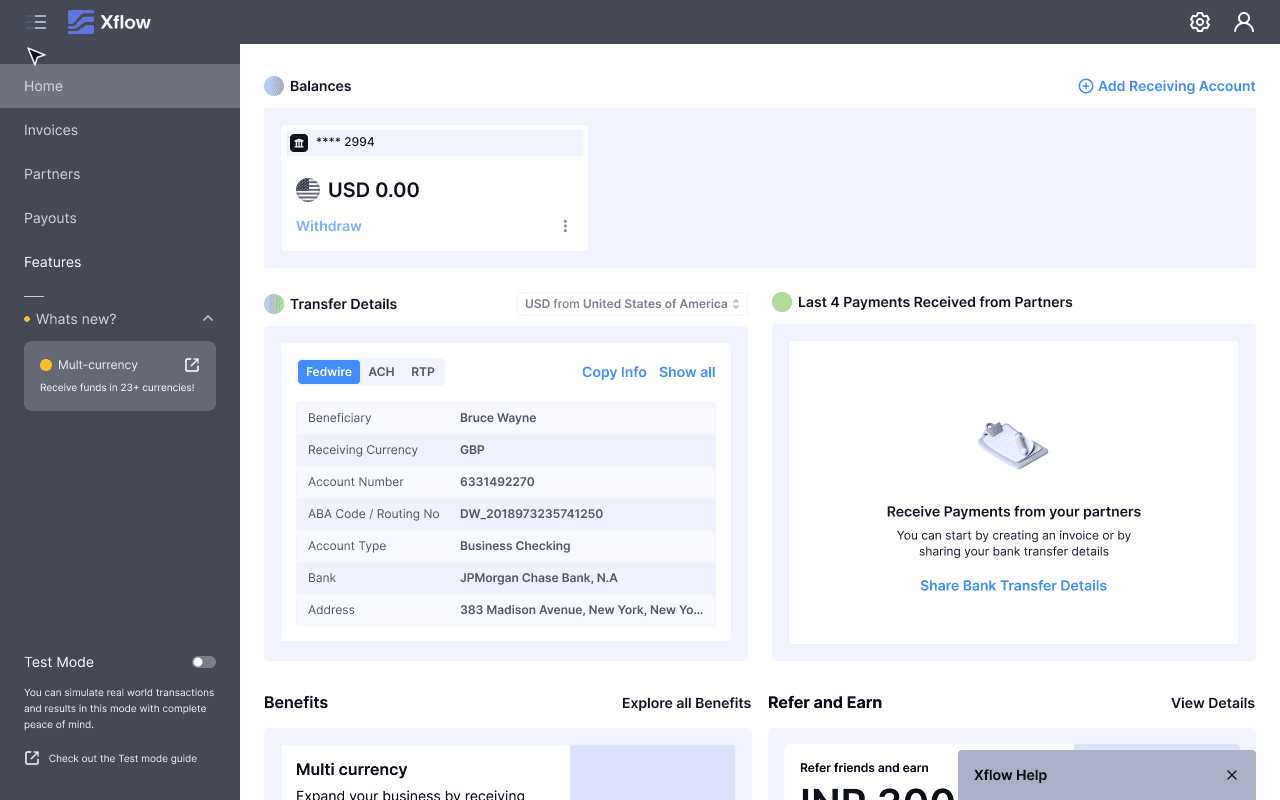
While many interaction patterns would be helpful for various features inside Xflow Dashboard, CTAs were already scoped into a separate product revamp — out of scope here. Automation was ruled out because Xflow involves real money movement at every stage; users need to stay in voluntary control of every action. therefore having an AI Powered Chat Window would be a perfect fit for Xflow's AI Help for providing help to the users.
AI chat windows often include an option to escalate unresolved queries to human support, ensuring users can still get help when AI falls short.
Chat interfaces that required longer or distinct context maintained separate chat histories, while simpler use cases relied on a single chat thread with an option to reset conversations when needed.
Many platforms use chat interfaces where AI understands page-level context and answers user queries directly within a chat window.
User Research
I ran consecutive working sessions with the Product and Ops teams to pull from two sources: user feedback surveys from Product, and real support ticket subjects from Ops.
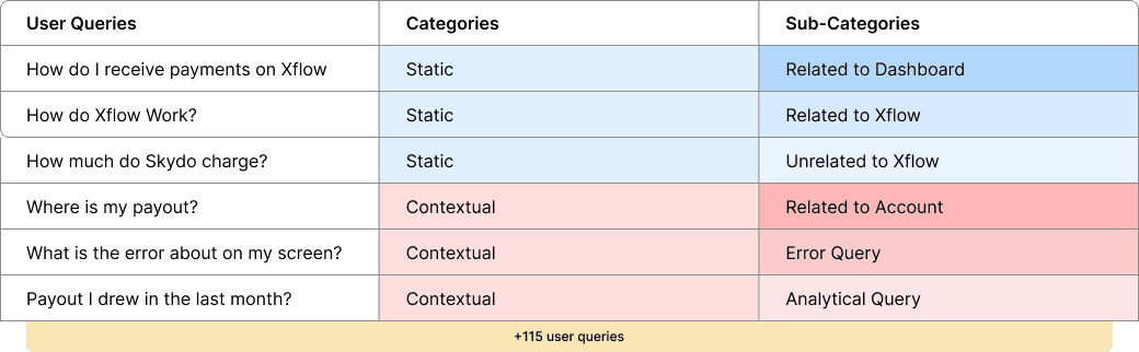
Analysing the internal insights, I noted down
User Queries
I categorized and sub-categorized each query to find patterns. The key finding: most queries weren't about understanding Xflow in general — they were contextual. Users were getting stuck mid-task, on screens they were already looking at, and reaching out to support instead of pushing through.
This reframed the design problem. It wasn't enough to build a smarter FAQ. The help experience needed to be contextual - present at the right moment, understanding where the user was in the product, and answering what was in front of them.
This activity has helped me gain clarity on the different types of queries that users ask, allowing me to write related user stories.
User Stories
After categorizing the user queries, I consolidated them into broader user stories. This approach ensured that each user story captured multiple related queries, allowing me to design scalable solutions without having to address every individual query separately.
Related to Chat Window Design
"How do I access Help?"
"How do I access static help?"
"How do I start access previous chats?"
"How do I start a new chat?"
"How do I get a human assistance?"
"How do I access support tickets?"
"How do I provide feedback?"
Related to Queries
“I have a general query about Xflow or related to Xflow”
“I need help, while I am in the middle of a process”
“I have a query about what is in my current screen”
“I have a query about how to do perform a certain task?”
“I have a query about actions that I have performed on Xflow”
Explorations
User Story: "How do I access Help?"


Shortlisted Explorations
Out of the 9 Explorations for accessing AI Help, I shortlisted 4 of them. These are Floating Action Button, Side Sheet, Top Navigation and Bottom Chat and tested these explorations on all types of screens like Modals and Shorter Modals.
Floating Action Button
Pros
Movable
Cons
Blocks content before triggering
Feels intrusive on modals
Breaks mental model of a modal

On Pages

On Full Page Modal

On Shorter Modal
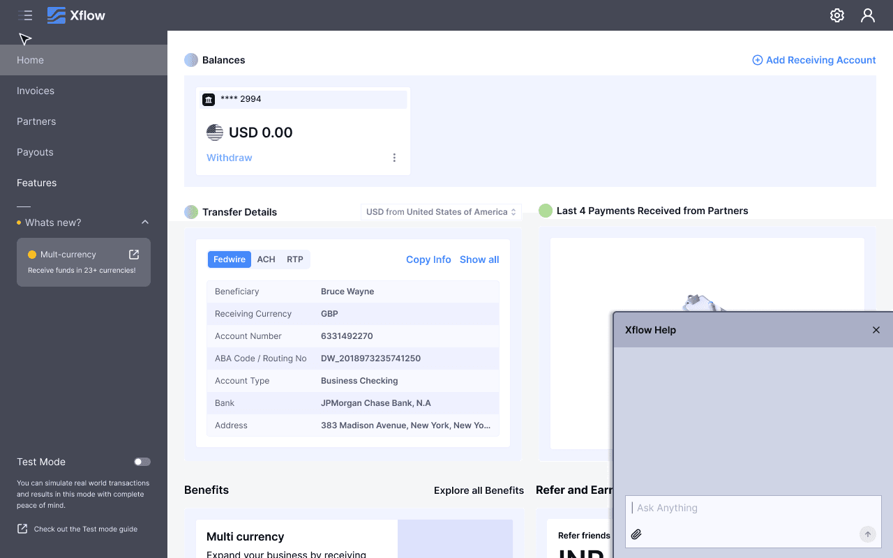
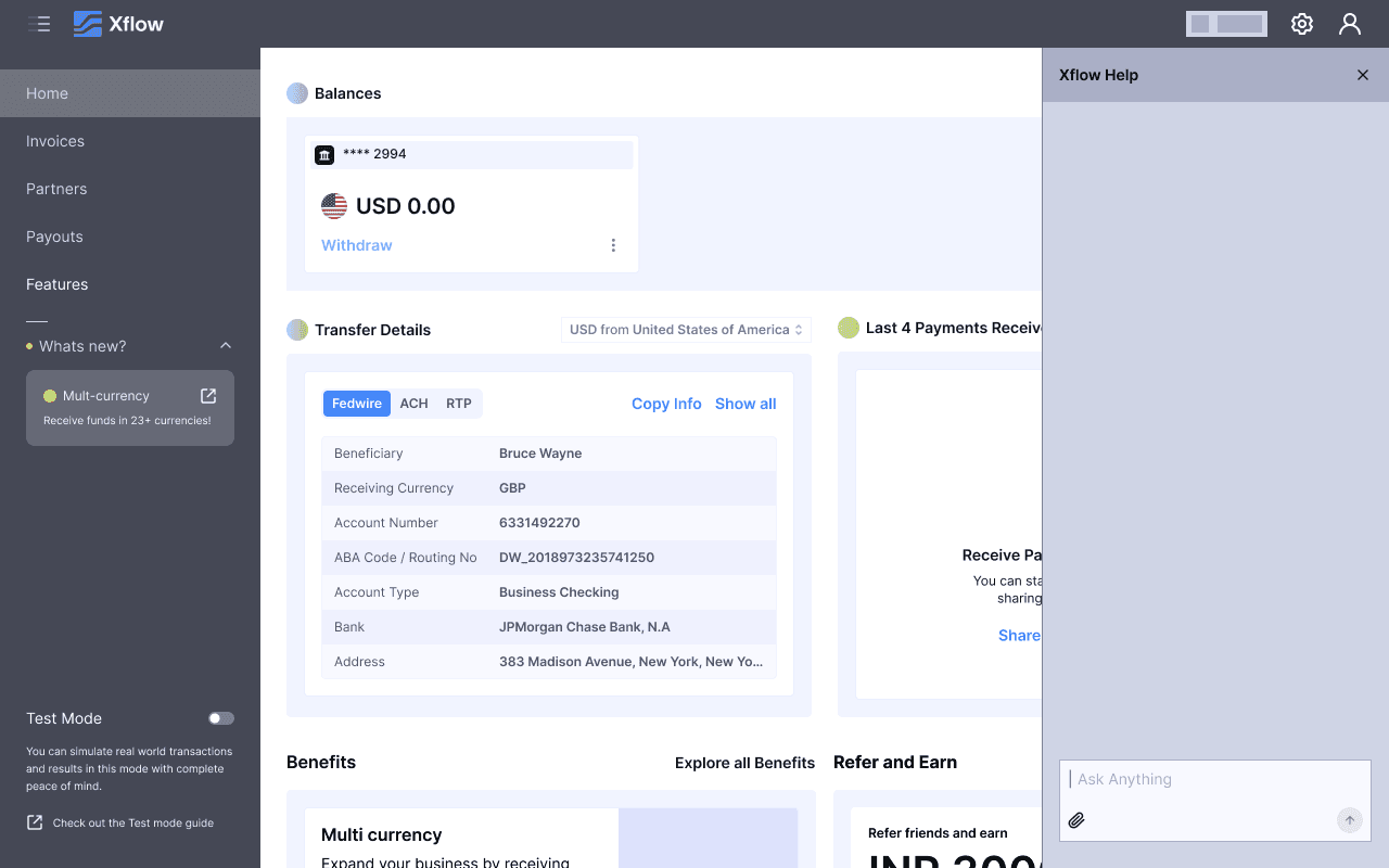
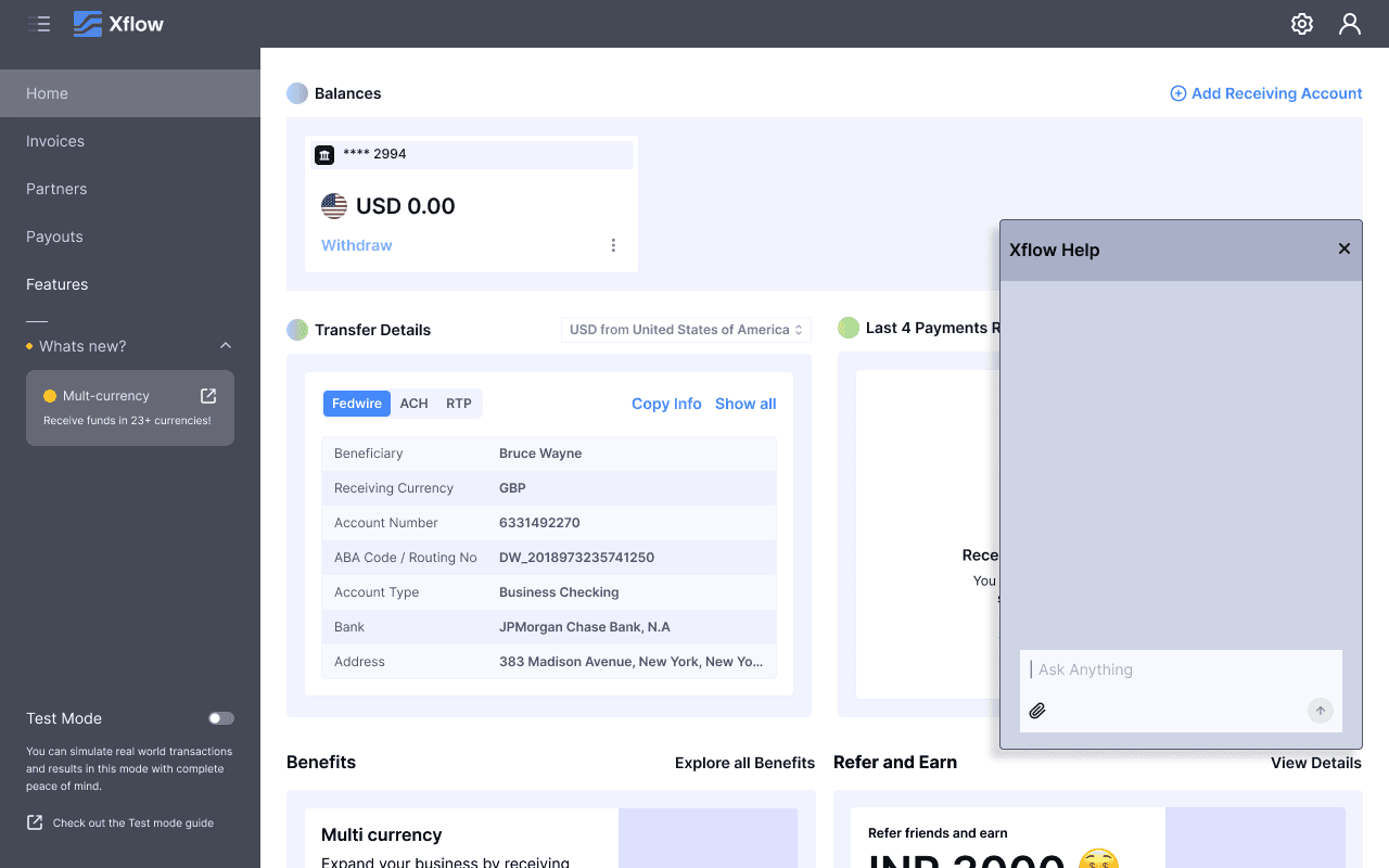
Side Sheet
Pros
Universal position to trigger help
Seems to understand Global Context
Doesn’t blocks content before triggering
Cons
Breaks the mental model of a modal
Immovable
It will still block content

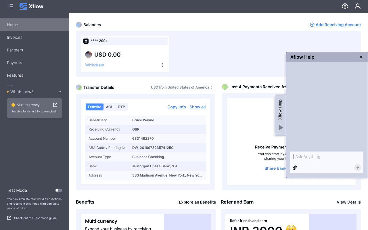
On Pages
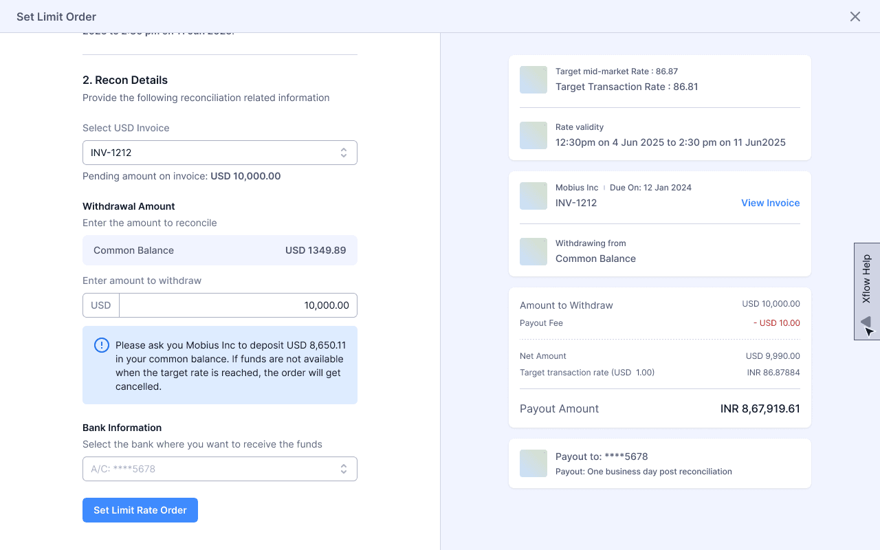
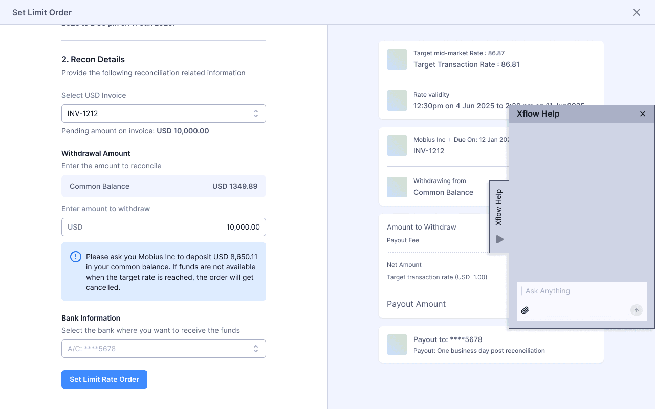
On Full Page Modal

On Shorter Modal
Top Navigation
Pros
Good Visibility
Doesn’t blocks content before triggering.
Cons
Point of trigger changes
Design changes has to be done on every modal
Seems it doesn’t understands global context

On Pages

On Full Page Modal


On Shorter Modal
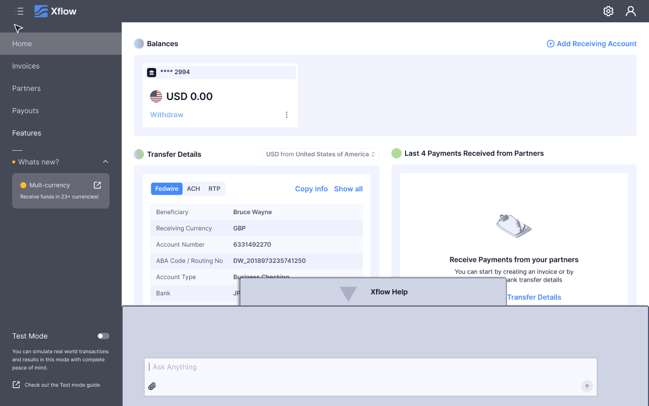
Bottom Chat
Pros
Familiar chat experience, like LinkedIn, FB
Cons
Takes space even before triggering
Feels intrusive in shorter modals
Breaks the mental model of a modal

On Pages


On Full Page Modal

On Shorter Modal
Selecting a Chat Window from Explorations
The chat window design was selected based on how effectively it satisfied the defined design considerations. Among the explored options, it addressed the highest number of key requirements, making it the most suitable direction for further development of the AI Help experience.
